Design
I used to dread designing pages until I realized its importance. Design sets the tone for every page; it tells the story before eyes begin to scan the article. I learned to embrace this and weave design into the way I approach stories.
1.
2.
3.
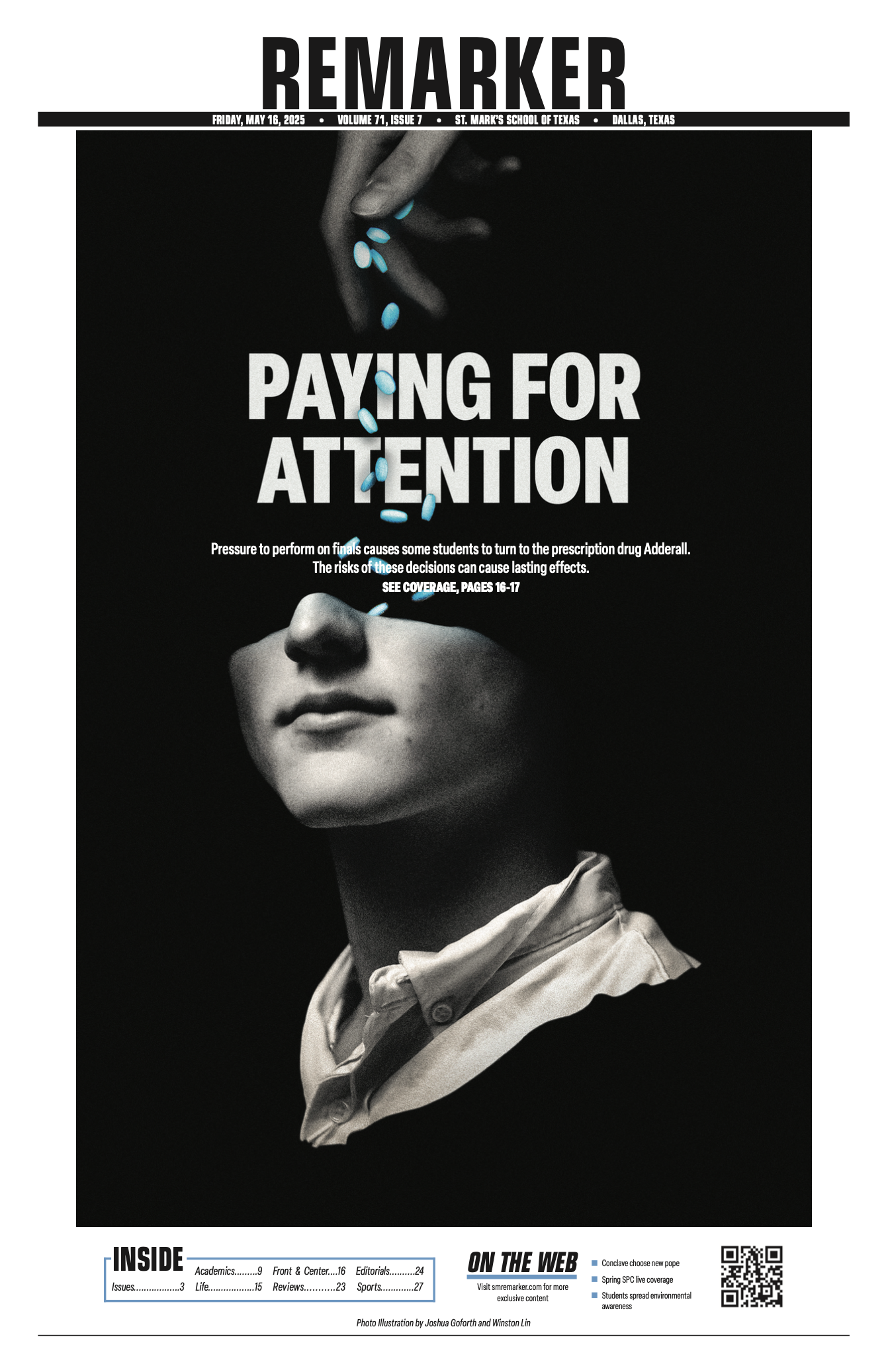
My first edition as Editor-In-Chief. I wanted to capture the sentiment around illicit Adderall usage being a “cure-all” for academic troubles, so we worked to illustrate a student with pills being poured into the brain. I wanted to use a black in the background to capture this void-esque dynamic, and we used 4-color black to ensure printing quality would remain optimal.
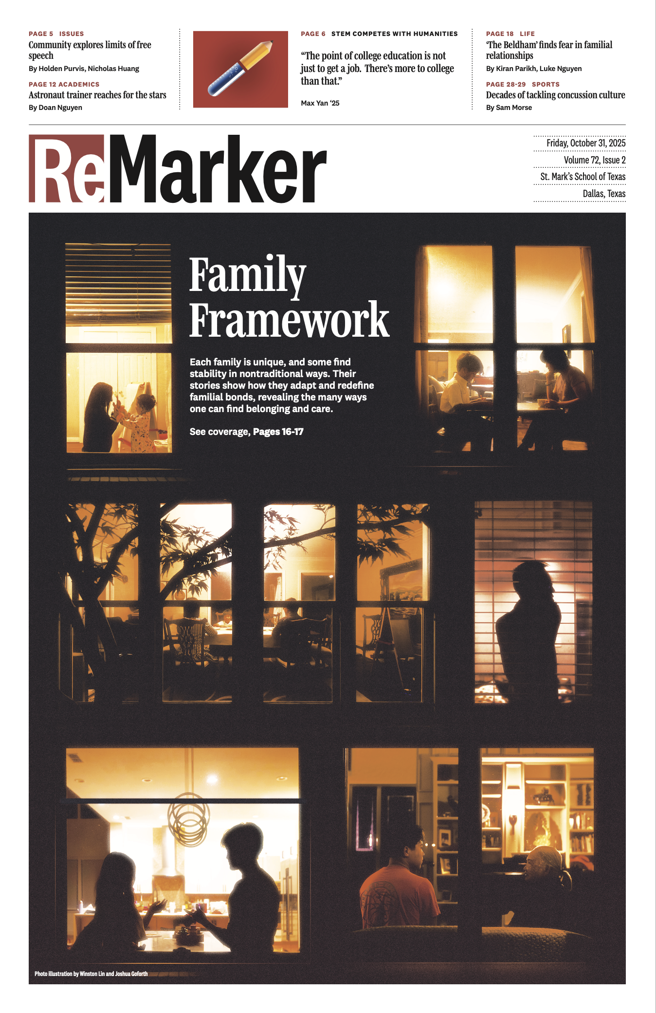
Over the summer, the top editors and I worked to redesign the newspaper in a way that felt modern yet sophisticated. My primary goal was to give my staff the best opportunity to be creative with their design. We decided to emphasize white space as a staple design ethos. In addition, we used more columns to support readers’ viewing pleasure.
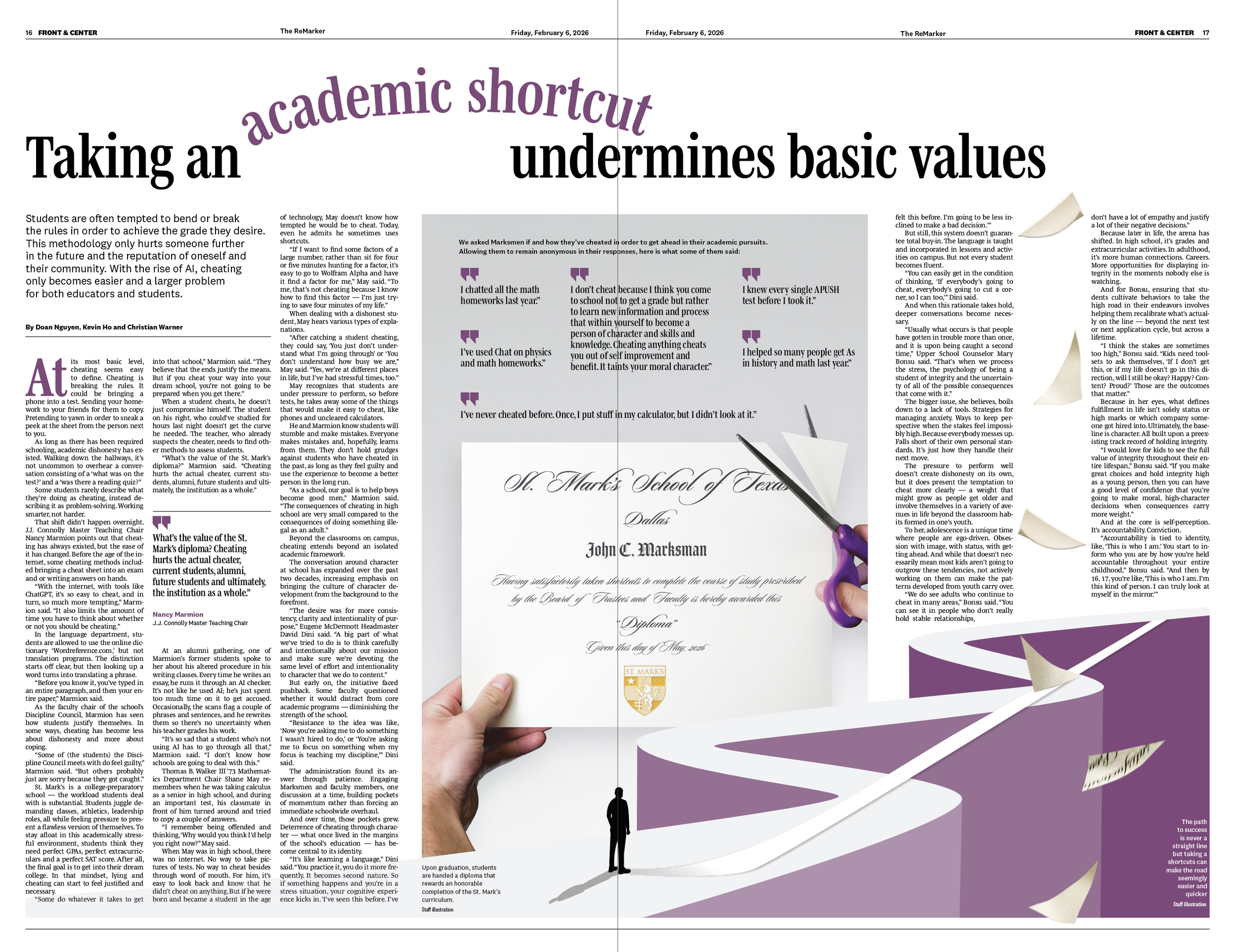
Cheating has been pitched frequently in our newsroom, so, when we decided to pursue the story, we took it from an angle of taking shortcuts. My goal with the design of this spread was to express how the legitimacy of one’s achievements and the retainment of knowledge is weakened by cutting corners.
4.
5.
6.
For our October cover, I wanted to capture how similar houses may look from the outside, yet, inside, each familial dynamic is so diverse. The framing and coloring for this cover was intentional to convey this primary theme of the story. We chose to silhouette each figure to keep each picture as ubiquitous as possible
Continuing on our redesign work over the summer, I wanted to continue structuring our section fronts the same way. We decided to remove briefs, leaning on our website to handle that type of content, and used the additional space for white space and teasers at the top.
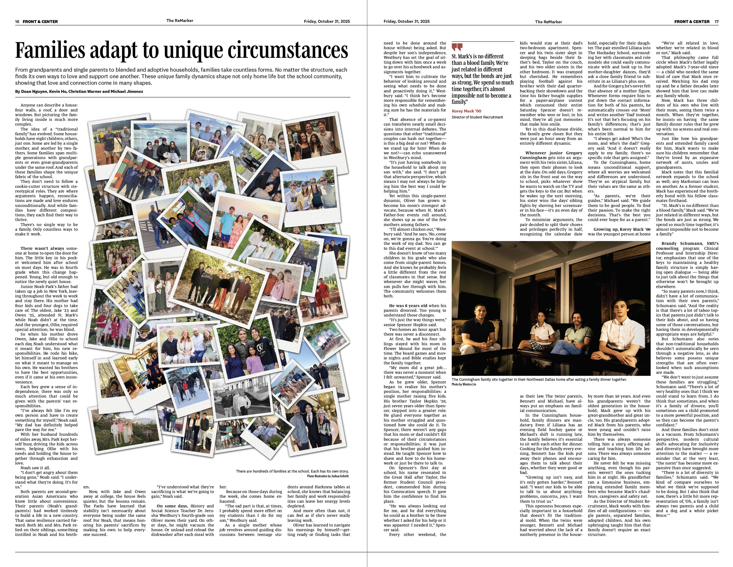
The center spread for the family dynamics story required a lot of community involvement. I wanted to showcase families from our community, so I reached out to parents of the entire student body for photo submissions. I received around 100 photos which we used for the central collage. The secondary visual highlights a family that was interviewed in the story with an extraordinary story. The typography of the story supported the vignette style we used; bolding the first view words of each family allowed for better clarity from a reader’s perspective.